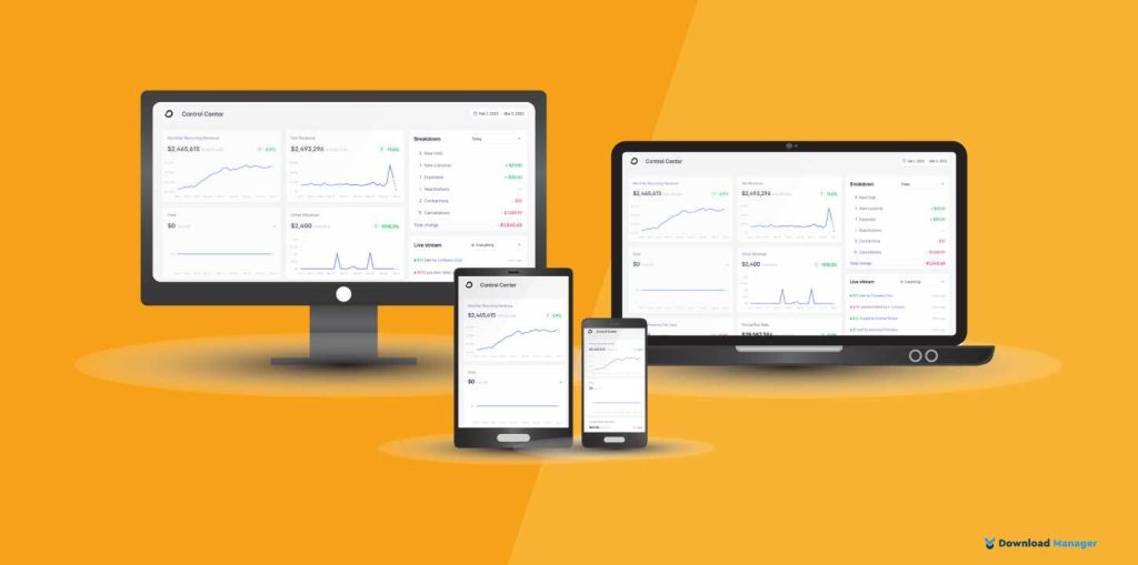
Nowadays, people use smartphones, tablets, laptops, desktop computers, TVs, and even smart watches to browse websites. With the staggering growth of those devices, it’s essential that your website is responsive so that you can provide the most satisfying user experience no matter what type of device they are using. Want to know more about website responsiveness?
In this article, we will discuss what website responsiveness is, why it is important, and lastly, how to test your website responsiveness.
What is Website Responsiveness? What Does Responsive Website Mean?

Website responsiveness refers to the ability of a website to adapt to different screen sizes and devices, such as desktops, laptops, tablets, and smartphones, and provide an optimal viewing and user experience.
A responsive website adjusts its layout, content, and functionality based on the screen size and orientations of the device. It allows users to easily navigate, read, and interact with the site without having to zoom in or out or scroll horizontally. This is achieved through the use of flexible grids, images, and media queries that dynamically adjust the presentation of the content. Responsive web design has become increasingly important as more people use mobile devices to access the internet. Not only that, search engines like Google prioritize mobile-friendly websites in their rankings.
Why Website Responsiveness is Important?
These are some of the biggest reasons the responsiveness of a website should be high in your priorities.
Improved user experience: A responsiveness of the website ensures that the website adapts to different screen sizes for making it easier to navigate and use on any device. This creates a better user experience for your audience, increasing the chances of them staying on your site longer and engaging with your content.
Increased mobile usage: With the increasing use of mobile devices for browsing the web, it is essential that websites are responsive to accommodate different screen sizes. By ensuring that your website is responsive, you can reach a larger audience and improve your chances of being found in search results.
Better search engine rankings: Google prioritizes responsive websites in its search results, so having a responsive design web page can improve your search engine optimization (SEO) efforts. This means that your website will rank higher in search results, increasing your visibility and driving more traffic to your site.
Lower bounce rates: If your website is not responsive, visitors may leave your site quickly if they have trouble viewing or navigating it. By improving the user experience with a responsive website, you can reduce bounce rates and increase the likelihood of visitors staying on your site and engaging with your content.
Increased conversion rates: A responsive website ensures that users can access and use your website on any device, which can lead to increased conversions. If users can easily navigate and use your website on their mobile devices, they are more likely to convert into customers.
Cost-effective: A responsive website eliminates the need to create separate websites for different devices, which can be costly and time-consuming. A single responsive website can work on any device, which is more cost-effective and efficient.
How to Test the Responsiveness of a Website?
Testing website responsiveness is important to ensure that your website provides a consistent and user-friendly experience across different devices and screen sizes. Here are some ways to test your website’s responsiveness.
Use browser developer tools:
Most modern browsers, such as Google Chrome, Firefox, and Safari, have built-in tools that allow you to test your website’s responsiveness on different device sizes. For example,
Google Chrome has built-in developer tools that can be used to test website responsiveness. Here are the steps to test website responsiveness using Google Chrome:
First, go to the website you want to test using Google Chrome and right-click anywhere on the page and select “Inspect” from the drop-down menu.
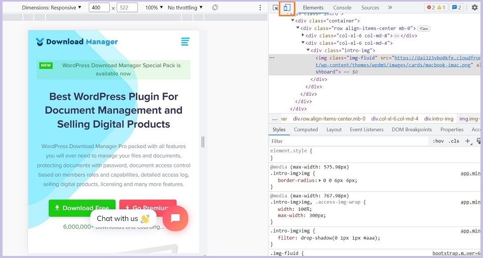
Then, this will open the Developer Tools panel. Click on the “Toggle device toolbar” icon at the top left corner of the panel (it looks like a smartphone and a tablet next to each other).
This will activate the Device Toolbar, which allows you to simulate the website on different devices and screen sizes. You can select the device type and the website will automatically reload and adjust to the selected device. You can then check how the website looks and behaves on the selected device.
Use online tools:
There are many online tools like Screenfly, BrowserStack, or Responsinator available to test website responsiveness. In this section, we will show you how to test website responsiveness with Screenfly. This tool allows you to test your website on various devices and screen sizes, including desktops, laptops, tablets, smartphones, and TVs.
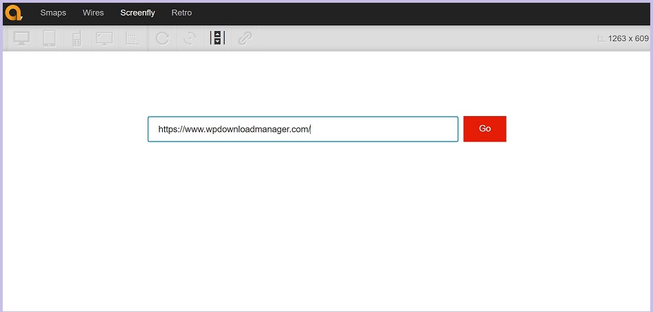
To start with, go to Screenfly.com in your web browser and enter the URL of the website you want to test in the text box.
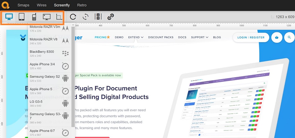
Now, choose the device type and screen size you want to test from the drop-down menu on the right side of the screen. Screenfly offers a range of options, including desktops, laptops, tablets, smartphones, and TVs. You can even choose a custom device size with this tool.
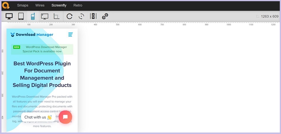
As soon as you choose the device type you can see how the website looks on the selected device and the screen size.
With this tool, you can also use the “rotate” and “scroll” options to see how the website responds to different orientations and scrolling behavior.
Test on real devices:
While device emulators are useful for testing responsiveness, they may not always provide an accurate representation of how your website looks and behaves on different devices. You can test your website on real devices like smartphones, tablets, and laptops to get a better idea of how it performs.
Perform user testing:
You can ask users to test your website on different devices and screen sizes and provide feedback on the user experience. This can be done through usability testing, surveys, or focus groups.
Analyze website analytics:
Website analytics tools like Google Analytics can provide insights into how users are accessing your website and what devices they are using. This data can help you identify areas where your website may need to be optimized for specific devices.
Manually resizing the browser window:
Another way to test website responsiveness is to manually resize the browser window to different sizes and see how the website adapts. This can give you a general idea of how the website will look on different devices.
How to make a website responsive?
To make a WordPress website responsive, you can follow these steps:
Choose a responsive theme: When selecting a WordPress theme select a theme that is designed to be responsive. A responsive theme adjusts its layout to fit different screen sizes, including desktops, tablets, and smartphones. This means when you’ll choose a responsive theme, the theme will adjust its layout and design to fit different screen sizes and resolutions.
Use a responsive plugin: There are many responsive plugins available for WordPress. Use plugins that are designed to be responsive, such as responsive sliders or galleries. These plugins can help to optimize your website for mobile devices and ensure that your content is easily accessible on any device.
Use grids for a mobile-friendly design: A responsive site must adapt to any screen size and grids play an important role in enabling the content to resize in a way that fits the screen. If you are seeking a grid system for your responsive layout, try Bootstrap.
Optimize your images: Images can be a big factor in how quickly your website loads, which is important for mobile devices. Optimize images for the web and ensure they are appropriately sized for each device. This can help reduce the load time of your site on mobile devices.
The coding for creating responsive images is relatively simple:
img {
max-width: 100%;
}
Use a responsive menu: Ensure that your website’s navigation menu is easily accessible on all devices. Use a responsive menu plugin to make it easier for users to navigate your site on mobile devices.
Optimize for speed: Ensure that your website loads quickly on mobile devices by using caching plugins, optimizing your code, and minimizing the use of scripts and plugins that slow down your website.
Conclusion:
Your website responsiveness not only improves your user experience but also optimizes your SEO. Hope this article helped you to understand the importance of website responsiveness, how to test your website responsiveness and who you can make your WordPress website responsive.
If you found this article helpful, please subscribe to our YouTube channel to get more tutorials related to WordPress. Also, you can join our Facebook page to update yourself with more tips, solutions, offers, and so on.