Are you searching for an advanced level of Gutenberg block that will build your website precisely the way you want it to look? Attire Blocks By WP Attire is the leading level of editor block that use to create your pages and posts in fast and amazingly designed Page Layouts.
Besides, it provides highly customizable Gutenberg Blocks & layout and is very light on resource requirements. To be more precise, it’s an all-rounder page builder that offers more control over the WordPress block editor.
In this article, we are going to introduce the new level of block “Gutenberg Blocks and Page Layouts – Attire blocks” and describe its exclusive features.
Let’s begin!
A Brief Introduction to Attire Blocks
Installation & Activation:
First, you have to download the open-source plugin Gutenberg Blocks and Page Layouts – Attire Blocks from WordPress.org and install it.
Or you can install it from your admin dashboard plugin library. To do that, you need to go to your admin dashboard and go to Plugins ► Add new option and search the Attire blocks from the plugin library, and install it. Once you have installed the plugin, you must activate it to see its free features.
Key Features of Attire Blocks
After activating the plugin, you will see the following scenario in your WordPress site when you open a page or post editor.
Here, you need to click the plus button to add a block and select the Attire block.
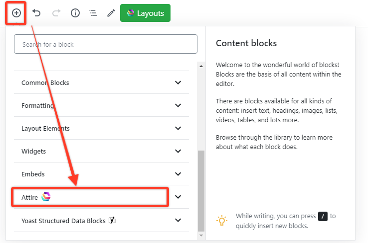
Now here you will see the exclusive feature of this editor block.
Let’s see what’s coming out from there…
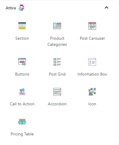
- Html Section
- Post Carousel
- Product Categories
- Information Box
- Buttons
- Call To Action
- Post Grid
- Accordion
- Icon
- Pricing Table
Now, In the following section, I will describe each block and how it helps your work.
1. HTML Section
The section block of this editor gives you the option to combine multiple blocks from your editor. For instance, you can use various blocks such as common blocks ( paragraph, image, quote, audio, video list, etc.) layout elements, widgets, embeds, etc.) in one block.
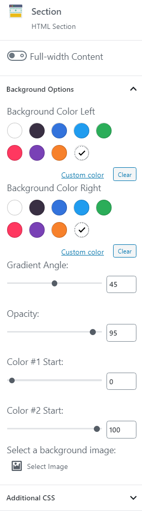
Not only this, but also you can get some customizable features of setting the background color of the section block, or you can set a background image for that block. Moreover, you can change the gradient angle, and opacity, and add some custom CSS on that block.
2. Post Carousel
This Post Carousel provides the feature to set the post type, category etc. The additional settings of this block are given below,
Content Settings – This option allows you to sort your post by date and title in ascending or descending way. Also, you can set the category and how many numbers of posts will show in that section.
Background Color – You can choose the background color of both the left and right parts of the post Carousel section and also set the gradient angle, the opacity of that color.
Additional CSS – If you need more options on that block, you can add the CSS on the custom CSS through the feature.
3. Product Categories
This feature helps to display a grid of products from your selected category, or categories for WooCommerce. Besides, here you can also select which category you want to show in the content and also how many items of the selected category you want to see in that row.
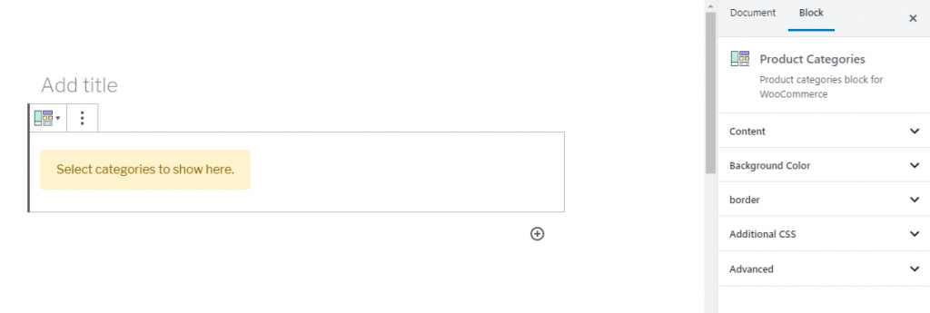
You can also find the feature of choosing the background color, image, and additional CSS just the same as the other blocks. One extra element you will get is setting up the border width, radius, and color.
4. Icon
This is an advanced icon block that supports FontAwesome and custom SVG. When you click on the icon box, you will get these features- icon, background shapes, color, and additional CSS.
Icon– Here, you can set the icon’s padding, radius, size, and alignment. Besides, there are lots of built-in icons you will find to choose for your content or can appear as an icon through the icon link.
Background Shape – Here, you will reach some prebuilt background shape of that icon.
Color– Through this color option, you can pick up the icon and background color and the icon hover color.
Additional CSS– If you need to add more features to that icon box, you can use this option to add the custom CSS here.
5. Information Box
This block allows you an option to add information like feature icons, names, and descriptions to your content. It is used for landing pages or between sections. Here you will find the template for adding your content to that block. Also, you can set the alignment of the content as the center, left, or right.
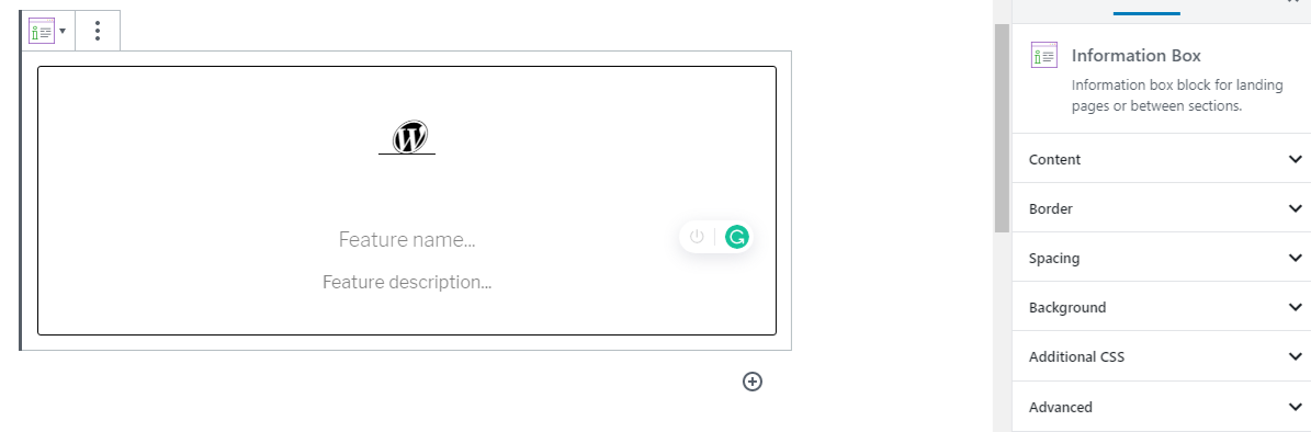
One exclusive feature of that block is you can set the icon block and its amazing features related to your information.
Now, Like the other attire blocks, you will get the same function of customizing the border, background, and additional CSS on the information box. One extra feature of that block is you will define the padding and margin length both from top to bottom and left to right from the spacing option.
6. Buttons
This is a slightly different and slightly advanced button block where you will find some common settings like arranging the button’s alignment, setting its padding, margin, width, radius, and font size.
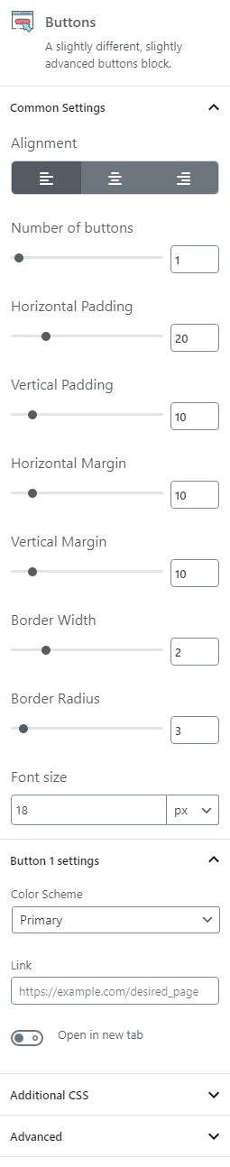
Also, In this block, you will set the numbers of buttons you want to show and define each button setting. In each button setting, you can add the color of the button from the nine pre-built color schemes and place a link on that button.
Above the exclusive feature, if you need more, you can simply write the custom CSS on the Additional CSS option.
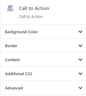
7. Call To Action
This block is mainly used on your landing pages to guide users toward your goal conversion. Further, you can write some text with the call to action button to attract more readers. This block also provides some customizable features like setting the background color, border color, content alignment, and additional CSS.
8. Post Grid
This post grid block lets you show your earlier post, page, or products by selecting categories. It also offers to choose the post type(post, product, page) with the chosen category following the ascending or descending order of date and title. Moreover, it lets you define the number of rows and the number of posts on each row. Furthermore, you can decide on the background color, border color, width, radius, etc.
9. Accordion
The Accordion block lets you the feature adding accordion drop-downs to your pages. It mainly uses for FAQs, Questions & Answers, or Testimonials. Further, you can change the behavior of the block, background color (gradient angle, opacity) border & text color, etc. The additional CSS options let you add custom CSS for the block.
10. Pricing Table
The pricing table block displays the different prices for a product or service in Tabular form. It also gives the option to add the Recurring payment feature in the price table. Moreover, like the other blocks, you can get the background color’s features, content (border, width, radius, and color) and additional CSS features.

Wrapping Up
In Summary, The onward level of the Attire blocks makes your customization easier and provides dynamic functionality, that creates a user-friendly interface for your website.
Hopefully, this tutorial helps you to understand each feature of Attire block more deeply.
If this article helps you, then please subscribe to our YouTube channel to get more tutorials related to WordPress. You may join our Facebook page to update yourself with more tips, solutions, offers, and so on. Or, You may regularly read our WordPress Tips and How-To’s to update yourself about WordPress.
You may also ask any questions related to it in the comment or want us to write on some specific topics you have in your mind. We appreciate your further comments, support or suggestions!