- This topic has 19 replies, 2 voices, and was last updated 6 years, 11 months ago by
Salahuddin Ahmed.
Hi,
I have noticed the shortcode does not view well on HTML table.
(You may view the images that I have attached)
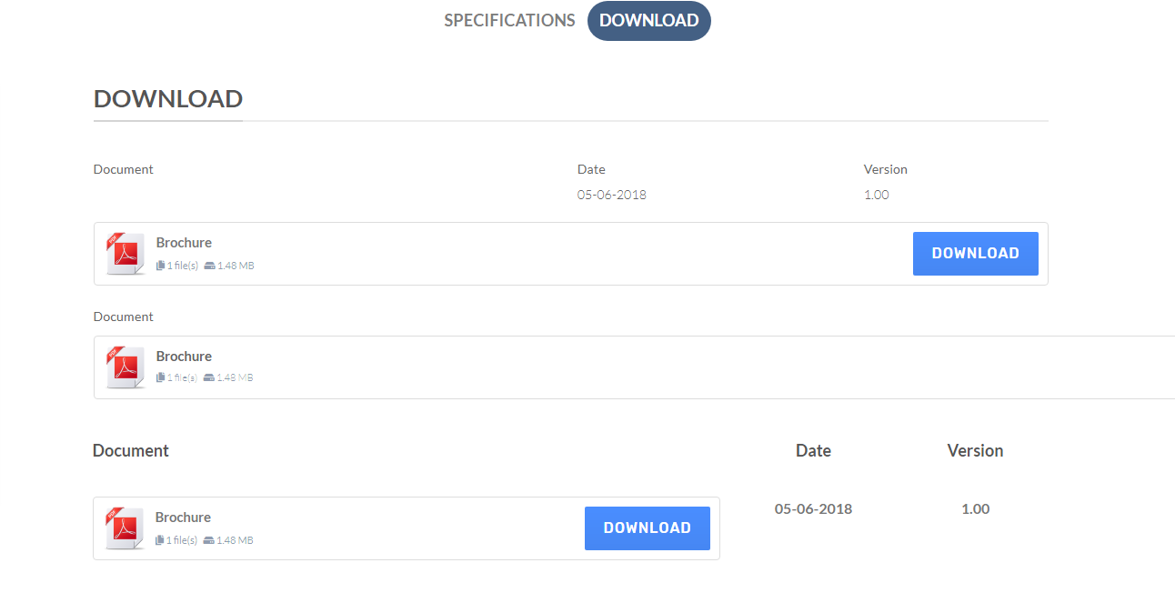
As you can see on “Black” circle, the shortcode is in the HTML table.
How to I resolve this? I need the shorcode to go into HTML table.
You may refer to this webpage: https://prolink2u.com/product/pmc1006/
Hi Ezzat,
Share me a temp Admin login in a private message I will sort out this for you.
Hi.
So is there any solution for this issue?
Thank you.
Hi Ezzat,
I am unable to login. Please send login link, login email and password!
Hi Ezzat, The login that you shared is not a complete Admin login. Share me an Admin Login details in a private msg.
Hi Salahuddin,
You can use the same login. I have changed your login role.
Thank you.
Hi, can you access already?
Hi, Could you please check your credentials? I am unable to login. Please send me fresh new login details to avoid confusion!
Hi.
Sorry out website have some issue. Now you can login and check for the issue.
Thank you.
Hi Ezzat,
Could you please install 2 plugins for me on ur site for some inspection?
1. File Manager
2. Updraftplus
Hi Ezzat,
Your issue is solved. See the link https://prolink2u.com/blocks/pmc1006/
Actually, it was your table formatting error .. not an error of WPDM. A picture is attached.
Hi Salahuddin
Sorry, I didn’t see any picture attached. And I have seen the web link but it is just the same.
<p><!– DivTable.com –></p>
<table>
<tbody>
<tr>
<td width=”50%”>Document</td>
<td width=”30%”><b>Date</b></td>
<td width=”20%”><b>Version</b></td>
</tr>
<tr>
<td>[wpdm_package id='2171']</td> ===►> I need to put the short code inside this.
<td align=”center”>05-06-2018</td>
<td align=”center”>1.00</td>
</tr>
</tbody>
</table>
<p>[wpdm_package id='2171']</p> ==►> If put it outside the <table> the shortcode work well.
thank you.
Hi Ezzat,
I will surely solve your issue!
As I told earlier, Could you please install 2 plugins for me on ur site for some inspection?
1. File Manager
2. Updraftplus
Looking forward to hear from you.
Hi Ezzat,
Please have a look below. I think your UX plugin is designed to work like this. Pls check and let me know if you like this solution.
Hi Salahuddin,
Sorry I did not really like that kind of solution. It’s because on mobile view will looks weird if you use column..
Somehow I get the solution by changing some CSS.
Here’s my CSS:
/*Download Plugins*/
.w3eden .link-template-default.thumbnail {
padding: 10px;
width: 230px;
}
.w3eden .link-template-default.thumbnail .wpdm-download-link.btn {
padding: 0 10px !important;
line-height: 30px !important;
font-size: 7pt;
}
.w3eden .media-body {
width: 90px;
}
.w3eden .wpdm_icon {
box-shadow: none;
min-width: 39px;
}
/*END Download Plugins*/
Just that I use this CSS just for mobile view. But desktop view also follows the CSS.. If possible can you make the view 100% just for desktop view?
Thank you.
Awesome! Somehow you made it on your own!
The topic "shortcode does not work well on HTML table." is closed to new replies.