Integrated Templates

WordPress Download Manager Pro has integrated template system to control how download package links and pages should look like. There are 2 types of templates: Link Template and Page Template.
Link template:
Link templates are used to render download manager package and category short-code. Link templates usually for showing summery type info of a package, here is a example comparative image for a random package:
- Selected link template:
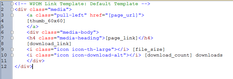
- In background, this is the code for selected link template:
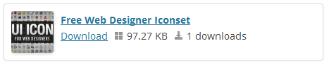
- Now if you embed the short-code of the package in a page or post content, at front-end it will look like:
Page template:
Page template used to show detailed data of a specific package. WPDM Pro invokes page template when you enter a package URL, as wpdm pro generate separate SEO friendly URL for every package you created. If you check note#3 in link template section (the screenshot for link template code) , the template tag [page_url] actually return Package URL. which will link the image with the details page for the package “Free Web Designer Iconset” and [page_link] template return URL linked with package title “Free Web Designer Iconset”, as you seeing in link template front-end preview screenshot above.

All valid template tags are explained below:
| Template Variables | ||||||||||||||||||||||||||||||||||||||||||||
|---|---|---|---|---|---|---|---|---|---|---|---|---|---|---|---|---|---|---|---|---|---|---|---|---|---|---|---|---|---|---|---|---|---|---|---|---|---|---|---|---|---|---|---|---|
|
Prettify your Download Link:
Rather then using plain download link you may want to use pretty download button. So, you simply need to do the following to accomplish that:
[download_link] – will generate plain download link <a href=”download-url-here”>link label of your download pacakge</a>
[download_link additional css classes here] – this will apply all css class to the download link you added here. More specifically:
[download_link btn btn-lage btn-success] – this will generate link with classes “btn btn-lage btn-success” ,
so it will be like <a href=”download-url-here” class=”btn btn-lage btn-success”>link label of your download pacakge</a>
as we are using bootstrap.css and bootstrap.css has some build-in button styles , the link will look like the download button here: Download
applied classes “btn btn-large btn-success”
“btn-large” class made this button size larger
“btn-success” for green color
alternatively, for other colors you can try:
“btn-info”, “btn-warning”, “btn-inverse”, “btn-danger” in place of “btn-success”
Button Styles
| Button | class=”” | Description |
|---|---|---|
btn |
Standard gray button with gradient | |
btn btn-primary |
Provides extra visual weight and identifies the primary action in a set of buttons | |
btn btn-info |
Used as an alternative to the default styles | |
btn btn-success |
Indicates a successful or positive action | |
btn btn-warning |
Indicates caution should be taken with this action | |
btn btn-danger |
Indicates a dangerous or potentially negative action | |
btn btn-inverse |
Alternate dark gray button, not tied to a semantic action or use | |
btn btn-link |
Deemphasize a button by making it look like a link while maintaining button behavior |
Button sizes
Fancy larger or smaller buttons? Add .btn-large, .btn-small, or .btn-mini for additional sizes.
Create block level buttons—those that span the full width of a parent— by adding .btn-block.
Using Your Own Image Instead of Default Buttons:
Yes, very simple, 2 ways there to do that:
- Create a css class with a background image for download link and apply the css class to download link, For example, add following css in your theme css file style.css
.my_custom_image_button { background: url(‘http://cdn4.iconfinder.com/data/icons/cc_mono_icon_set/blacks/48×48/download.png’) left center no-repeat; width: 48px; height:48px; }
Now you apply the class with download link tag, like:
[download_link my_custom_image_button]
- Use image url directly like this:
[download_link http://cdn4.iconfinder.com/data/icons/cc_mono_icon_set/blacks/48×48/download.png]
- Don’t even want to change template? OK, Just install this add-on: WPDM Image Button
So if you still need more explanation on creating a link or page template, please post in our forum or ask live support person here:
Otherwise, you may process to section:
List of Download Manager Pro Short-codes